|
Chemguide: Support for CIE A level Chemistry Paper 5 Graphs Introduction You will need:
Everything else apart from the points and any lines you draw should be in ink. Choosing the axes In the 3 years from 2014 to 2016, CIE gave you a piece of graph paper with the axes already labelled so there isn't a problem. But there is no reason why they couldn't go back to their previous practice of just giving you a blank grid where you have to decide how to set it out. If you have to decide for yourself, there are two things to think about - which variable goes on which axis, and what sort of scale to use. Which variable goes where? The independent variable is the one which you are deciding to change. For example, you might be measuring something at various different times which you choose, or at various different temperatures, or at various different concentrations. Each of these would be the independent variable. The dependent variable is the one which changes because of the changes in the independent variable. For example, the volume of a gas produced might be dependent on how long the experiment is running for. The volume is dependent on the time.
Choosing sensible scales Your graph should take up most of the graph paper, and not be squashed up in one corner! Choose a scale so that is true. That means that your axes needn't necessarily start from 0. It doesn't matter as long as they are clearly labelled. But it is important to make your graph easy to draw. That means choosing a scale where it is easy to plot the points without having to do fiddly calculations. That also means that you are making it easy for your examiner to check that you have plotted things properly. Plotting the points The Examiner's Reports make a very strong recommendation that points should be plotted using a small cross. If that is what they want, to do anything else would be stupid! It is essential that the centre of the cross exactly matches the data you are plotting - that is one of the reasons why a very sharp pencil is essential. There must be no doubt about where the centre of your cross is. If the point you are plotting is suposed to fall on a grid line, then even if you miss by a tiny bit, you will be penalised. There is a little bit more flexibility if the point falls somewhere between grid lines, but even here you should try to make the best possible estimate of where it should be, and plot it as exactly as you can. Drawing best fit lines The data which you are given to plot is likely to have two separate problems deliberately built-in - and that's true whether you end up with a straight line or a curve. The results that you are given to plot will all have some "experimental error" added. That means that however accurately you plot them, they probably won't all fall on a straight line or smooth curve. It is quite likely that at least one of the results that you are given will be anomalous. That means that the point is so far from the pattern shown by the rest of the points that it must have been wrong. You are quite likely to have to explain what might have caused it to be wrong. We will look at that later. Drawing straight line graphs Plotting the points Suppose you were plotting the results of an experiment in which variable masses of magnesium were added to an excess of dilute sulphuric acid, and you measured the volume of hydrogen given off each time. Here are the results:
This is fairly obviously going to be a straight line, but before you do anything else ask yourself if there are any points which don't seem to fit tidily on that straight line - so-called "anomalous" points. In this case, the third point falls underneath the trend for all the rest of the points. Before you do anything else, check that you have plotted it correctly! Assuming that they are plotted correctly, do not include any anomalous points when you draw your line! You are quite likely to be asked to account for any anomalous points you find. In this case, the point is below the trend line. A smaller volume of hydrogen was recorded than you would expect. What might cause that? There are various possible reasons. You might have measured the volume of the hydrogen wrongly, recording a smaller volume than you should have. Or there might have been a leak of hydrogen from the apparatus before you collected it. Alternatively, you might have mis-weighed the magnesium. Perhaps you didn't have as much magnesium as you thought you had. The reasons will vary from experiment to experiment, but your answers should be as precise as possible. You won't get any credit for saying "There must have been an experimental error." You have to explain what the error might have been, and why it made the point too high or too low. Drawing the line The first thing to ask yourself each time is whether the line should go through the origin (0,0). In this case, if you had zero mass of magnesium, you would obviously get zero hydrogen produced - so the line must go through the origin. That is really helpful! That gives you one point which is absolutely certain, with no experimental error. That may well help you to decide exactly where to place your line. You are then going to draw a line of best fit which needn't necessarily go through any of the points which you have plotted (apart from the origin in this particular case). Draw your straight line with a ruler so that there is as even a scatter of points either side of the line as you can manage (ignoring any anomalous points). Your final graph will look something like this:
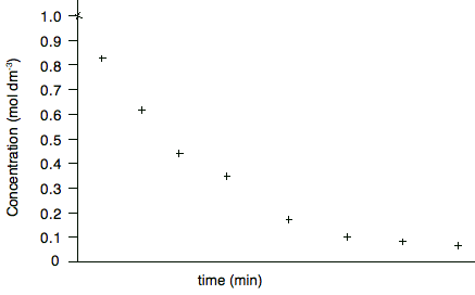
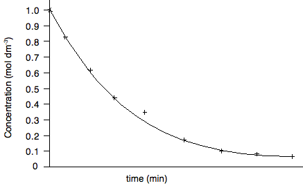
Drawing curved graphs This is no different from drawing straight line graphs, except that a good curve is a bit more difficult to draw well. This graph shows data gathered during a rate of reaction experiment in which the concentration of a reactant was measured against time. I am including a vertical scale on this graph because I shall need it further down the page.
Are there any anomalous points? Yes - the fifth point looks a bit higher than the trend. When you draw the curve, leave it out. Does the line go through the origin? Obviously not - although the first point at zero time could be taken as more accurate than the other concentrations because this is the solution you started with, and so you should know accurately what the original concentration was. So your curve will look like this:
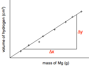
Curves are obviously more difficult to draw than straight lines especially if your results have an amount of experimental error. You can buy flexible rulers which will stay in whatever shape you bend them into. The only disadvantage is that they usually aren't transparent, and so it is difficult to judge when you have a proper best fit curve until after you have drawn it. If you are drawing the curves free-hand, help yourself by taking advantage of the way your wrist and arm moves. If you hold a pencil and rest your wrist on a table, and just move your wrist, you will draw a fairly smooth curve. If you want your curve to have a bigger radius, you could pivot your arm around the elbow joint instead. In the graph we've drawn above, you would have to turn the paper upside-down to take advantage of this, of course. Sometimes it takes several attempts to draw the best curve. Start off by drawing the line lightly, and then make it firmer when you are satisfied. At the end, rub out all the attempts that went wrong. You must end up with only one clean line! Measuring gradients It is highly likely that you will be asked to measure the gradient (or slope) of your graph. If you have a straight line, the gradient will obviously be for the whole line. If it is a curve it will be at some point on the curve. Measuring the gradient of a straight line. The slope is measured by drawing a large triangle as shown below. Examiners will expect you to make the triangle large to make measurements more accurate. You should not use points that you have plotted for the end points of the triangle unless they happen to fall exactly on the line.
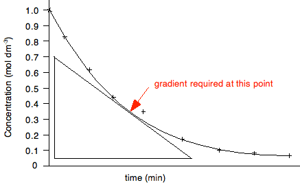
In this particular case, where the line goes through the origin, you could perfectly well use the origin as one of the ends of the triangle. The slope is given by the change in the y-axis value divided by the change in the x-axis value - Δy/Δx. In this case, it would be measured as volume of hydrogen per gram of magnesium. The examiners will almost certainly ask you to record the co-ordinates of the points you have used to draw your triangle. They use these to check that you have calculated the slope accurately. You must give the co-ordinates of each point in the standard format of (x, y). In this case, you would quote the co-ordinates of the end points of your triangle as (mass of magnesium value, volume of hydrogen value). Be careful with this. Examiner's Reports constantly criticise students for not giving these correctly. That is just a complete waste of a mark. Positive and negative gradients If your graph is sloping upwards (as this one is), the gradient is positive. The volume of hydrogen is increasing with the mass of magnesium. If the graph is sloping downwards, then the gradient is negative, and that must be shown in your answer. There is an example of this below. Measuring the gradient of a curve. Obviously, in this case, the slope is changing all the time, and so you will be asked to find the gradient at some particular point. To do that, you draw a tangent to the curve at the point, and use this to draw a triangle similar to the one above.
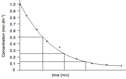
In this case, the gradient would be recorded as the change in concentration per minute at that point - again by measuring Δy/Δx. But this time, the concentration is falling with time, and so the gradient must be recorded as negative. If you get the sign wrong, you will lose the mark. Half lives Rates of reaction experiments are a good source of questions, and it is important that you know about things like orders of reaction, rate constants and half life. In particular you should know that half life is constant for a first order reaction, and the relationship between the half life and the rate constant for a first order reaction. It would pay you at this point to revise most of Section 8.1 from the Section 8 Menu. Finding half life is easy. The next graph actually finds three separate half lives for the same reaction.
In each case, the concentration is halved, and the time taken for it to fall by half is measured. If they are the same, then the reaction is first order. For showing that half life is constant, the half lives don't have to follow on from each other. For example, you could measure the half life as the concentration falls from 1.0 to 0.5, and from 0.8 to 0.4, or 0.6 to 0.3. It doesn't matter as long as the concentration halves. And finally . . . The greatest boost to your confidence would be to do as many graph questions as possible from recent papers in combination with the mark schemes and Examiner's Reports. This takes time - don't leave it until your revision. That is too late!
© Jim Clark 2017 |